
The production of e-learning starts with the conceptualization of the course and the right choice of tools. In the project phase of creation the focus is then on two main types of design in the area of e-learning design: instructional design (instructional designInstructional design in the context of e-learning is the process of planning, developing, implementing...) and graphic design. While instructional design describes the process of transforming content into understandable and engaging learning materials, graphic design in e-learning focuses on making the content attractive and interactive.
It's not just about making something "look nice", but more about how the design influences the success of the e-learning. A successful design is crucial for the learner's first impression and can increase both their motivation and their understanding of the training. Ideally, it even conveys messages and makes it easier to remember the content learned in the course. If you are looking for the right design for your e-learning, you should first consider who your target groupTarget group in the education sector: group of people with common characteristics for whom education... and which visual elements and effects are relevant to achieving the learning objectives. Once you have decided on a direction, make sure that the design language is applied consistently throughout the project.
There are numerous design styles that you can use and even combine as a learning designer. Below you will find a tried and tested selection of basic graphic design styles:
Minimalism is characterized by simplicity in the use of color, typography and composition and aims to convey content with clarity and efficiency. This style offers a clear and attractive aesthetic, improved usability and a coherent focus on the essentials.
This style could be described as a subcategory of minimalism. It is characterized by a two-dimensional visual language and avoids all design elements that create a 3D effect, such as drop shadows, bevels and textures. It is scalable, user-friendly and modern. Flat design has developed as a counter-current to skeuomorphism, a style that attempts to reproduce objects as realistically as possible. Flat design is particularly suitable for mobile user interfaces in e-learning. Google, for example, introduced a similar style, Material Design, in 2014.
Unlike flat design, this style uses three-dimensional illustrations, models and effects to create the tangible illusion of depth and realism in the e-learning course.
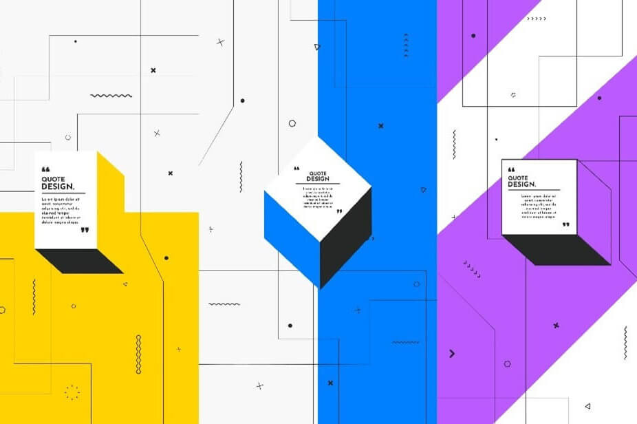
Isometrics is a special form of 3D design in which three-dimensional objects are created in a two-dimensional plane so that they create the perception of spatial depth. This method combines the advantages of 3D with simpler design and greater visibility of detail.
This design style is inspired by past eras and uses elements and concepts from the 1920s to the 1990s. It creates unique and nostalgic aesthetics, evokes emotions in suitable target groups and offers creative freedom when integrating into the learning experience.
This classic concept uses geometric shapes, patterns and abstract elements to create visual interest. It allows creative freedom, offers a variety of interpretations and can convey a modern aesthetic.
This style is inspired by comics and cartoons and uses simplified, exaggerated and sometimes humorous illustrations for Learning contentLearning content is the basis for knowledge and skills required in educational contexts.. It creates a playful and entertaining aesthetic, enables graphically clear communication and is appealing to different learners.
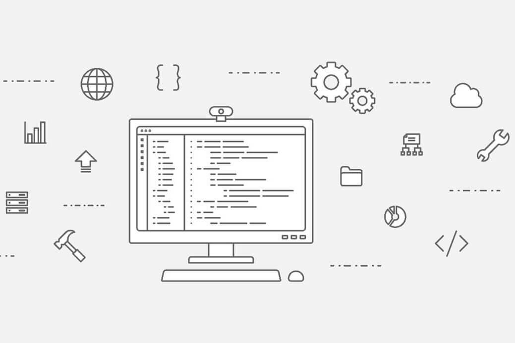
This style uses only lines to depict shapes, contours and textures. Lineart is usually drawn in black and white. The advantages are clear and simple representations, good scalability and the possibility for creative experiments.
This style combines different images, textures and graphics to create a compositional unity. The combination of illustration and photography can create unique, engaging content with a playful touch that can captivate the viewer and tell visual stories.
This style strives to make images or graphics look as realistic as possible, often through detailed rendering and high texture resolution. It creates a convincing and immersive visual experience and is well suited for product presentations or architectural visualizations.
Benefit from over 20 years of experience in the e-learning industry.